
Photo by author - using DALL-E 2
Note: a modified version of this article was first published here
A/B tests are the gold standard for estimating causal effects in product analytics. But in many cases they aren’t feasible. One of the most common ones is the feature release.
In this post I’ll discuss the common practice of measuring feature release impact using simple “before-after” comparisons and the biases that often plague such analyses. I’ll also give some advise on how those biases can be mitigated.
Feature release
Quite often, a company would release a new product feature or app version without running an A/B test to assess its impact on its main KPIs. That could be due to a myriad of reasons such as low traffic or high technical complexity.
Having deployed the feature to all users on a specific date product managers would usually try to gauge the feature release impact by doing a simple “before-after” analysis: comparing the KPI a short period after the launch to the same period before.
While intuitive, such naive comparisons may overlook important sources of bias.
Below I’ll discuss 2 of the most common sources of bias present in simple before-after analyses and how they can lead to erroneous conclusions.
Bias 1: Time effects
One common scenario is for a product manager to do a “before-after” analysis and obtain a positive result.
Looking at a plot of the KPI over time however they might run into a disappointing reckoning:
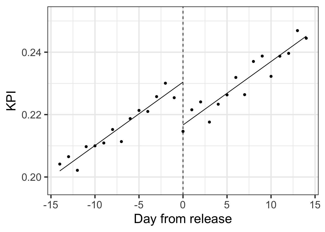
The KPI is on an upward trend throughout the period regardless of the release, whereas the release itself seems to have a negative impact. The simple “before-after” comparison assumes no time dynamics which can be very wrong like in the case illustrated above.
Bias 2: Change in mix of business
While biases introduced by time effects can be quite visible - others might be more subtle.
In another scenario a product manager might measure a negative “before-after” release impact. Plotting the KPI over time does not seem to offer an alternative conclusion:
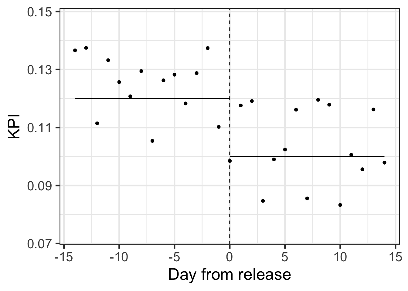
Many companies would stop here and assume the release was bad and needed to be rolled back.
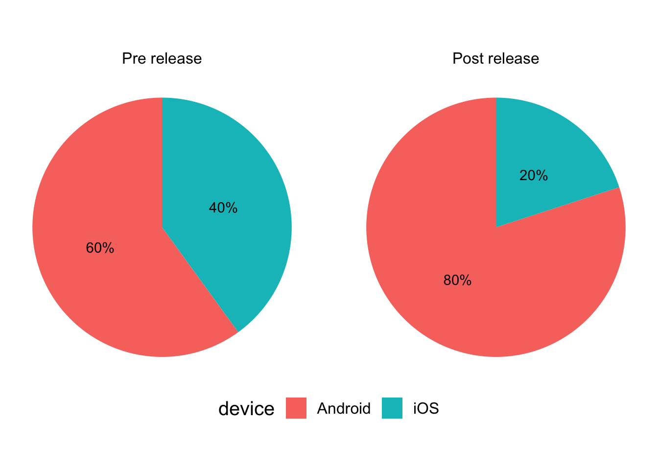
In many cases however the difference between the periods before and after the release may be due to a change in the mix of users. This can happen by chance but very often is related to marketing campaigns that accompany feature releases.
To make the example concrete it could be that the proportion of Android users has risen significantly during the period after the release compared with the one prior.
In this specific example, those Android users tend to convert less than iOS users, but the release effect itself within those groups is actually positive:
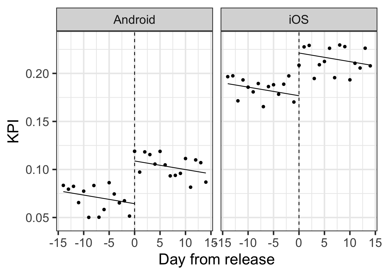
So taking device into account the release impact was actually positive. The scenario where the aggregate difference is opposite to the within group difference is a classic example of Simpson’s paradox).
Does that mean we can’t do without A/B tests?
The above cases were relatively simple. Time effects can include complex trends and daily seasonality, segment proportion changes can be more subtle and spread across many subsets etc.
One might get the impression that analyzing data from a feature release is useless. I argue however that must not necessarily be the case.
Enter the Release Impact Algorithm
Working at Loops I’ve devised an algorithm to automatically and transparently deal with the above biases. I can’t share the full implementation details for business and IP reasons, but below I present a general overview:
- Use an ML algorithm to find segments whose proportion in the population changed
the most between the pre and post-release periods.
- Model time trends and seasonality along with the release impact separately within each segment.
- Take a weighted average of the release impact estimated within all segments to arrive at the final impact estimate.
Testing the algorithm validity
You can never know for sure if any method works on a particular dataset. You can however get a rough estimate by using past A/B tests.
For example, an A/B test with control and treatment populations was executed for some period. Comparing the average KPI between those two groups yields an unbiased estimate of the treatment impact. This serves as our “Gold standard.”
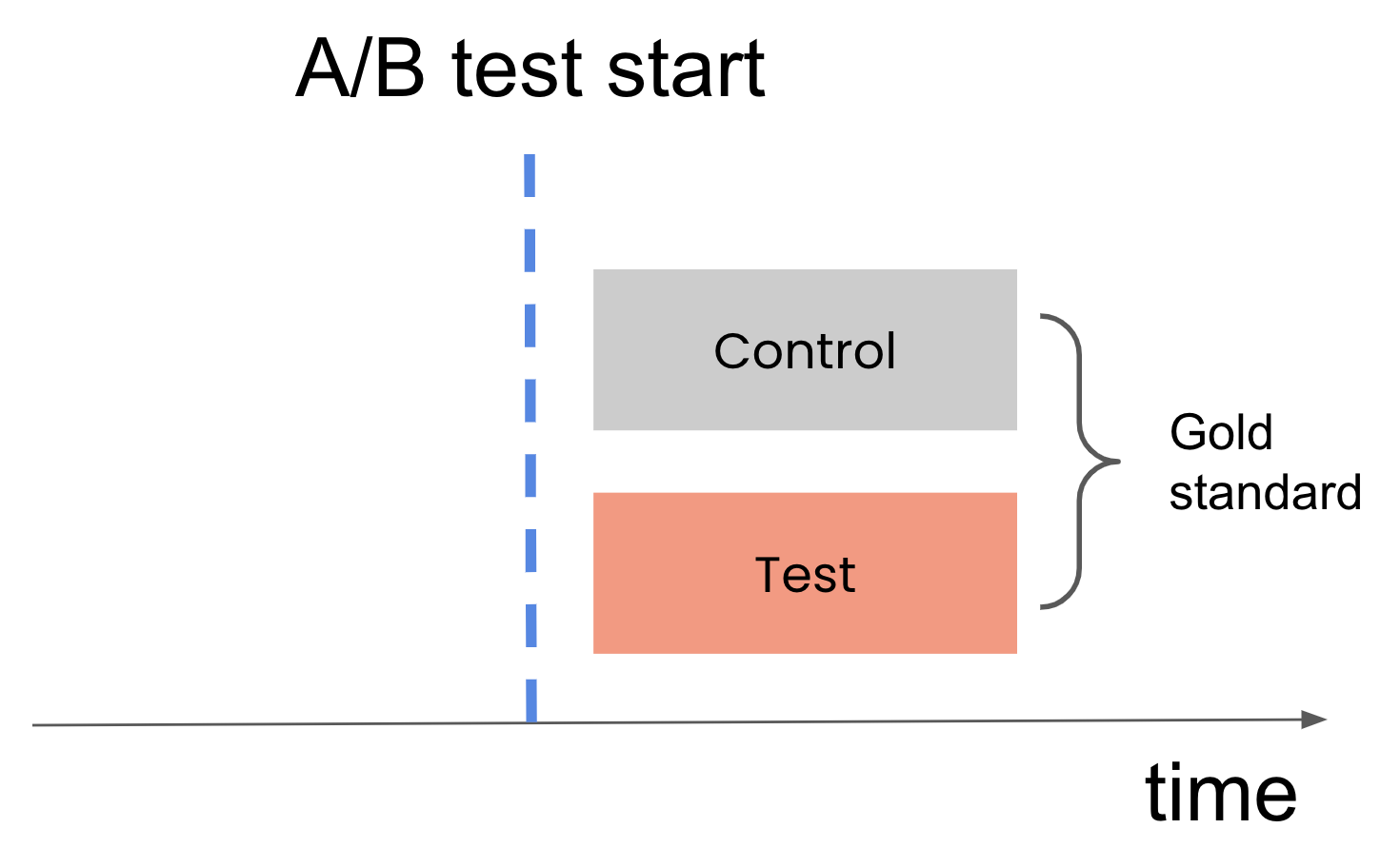
We’ll name the segment of users in the period before the test “pre-control.” Comparing the pre-control population to the treatment population is analogous to the comparison we do in a before-after analysis.
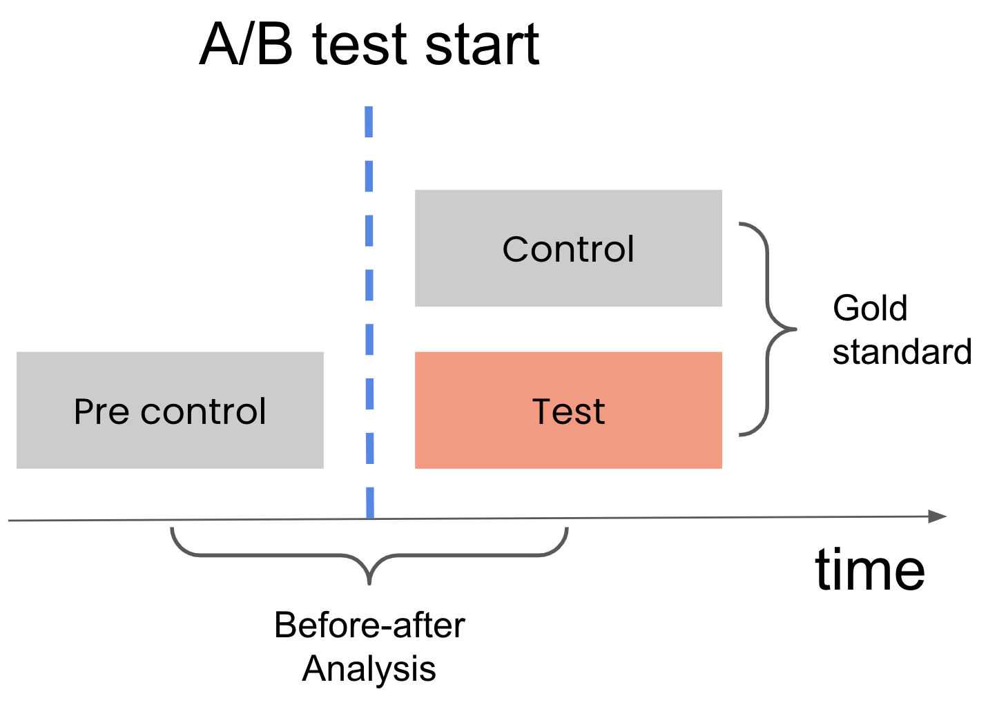
Using many different tests, we can compare the “Gold standard” estimates with the “before-after” estimates to see how close they tend to be.
Working at Loops I have access to hundreds of A/B tests from dozens of clients using our system. Using the above benchmarking method we’ve found that the algorithm has vastly superior accuracy to a simple “before-after” comparison.
In summary
I hope by this point the reader is convinced of the perils associated with using simple “before-after” comparison and that the algorithm outlined above will serve as a basis for anyone looking to better assess the impact generated by releasing a feature in their product.